Technical Writing
Thought Process
Technical writing is as much about process as it is about the final product. Here, I’ll walk you through my methodology for creating effective technical documentation by showing you a recent project where I rewrote Figma’s official tutorial. By breaking down my thought process, I aim to show not just what I changed, but why I made those decisions and how my process ensures documentation truly serves its intended users.
The term “technical writing” encompasses many forms of writing, yet, the process of presenting accurate, informative, and well-thought-out information will almost always follow similar steps. I’ll sometimes stray from the things below, but in general, here are some of the things I consider when sitting down to work on a project, and an example of how I’ve applied them to a project I’ve worked on.
The very first thing I do is gather firsthand experience about the topic that I’m going to write about. That requires me to use whatever it is and get an understanding of the thing itself. Preferably, if I’m writing informative content, I’ll use it enough to be an expert or at least confident enough to understand it. However, I at least get to the point where I can understand what a person starting from absolute zero will feel and think as they learn. If time doesn’t permit, or if I have access to people with more knowledge than me, this is a great time to ask questions about what they know, including their real experience with the topic, shortcuts they wish they knew when they were starting to learn, where best to start with something, and anything else I think is relevant to the topic.
After gathering requirements (“What am I writing? How-to guide? Tutorial? Manual?” etc.), I consider a couple of things in tandem. “Who am I writing for?” is generally one of the first thoughts that go through my head, as the way I’m going to structure the information will likely stem from what type of audience I’m writing for. For example, the way I’d present information to a child or an audience of children would vary wildly from how I’d present that same information to a group of adults. Similarly, things like the tone expected by my audience (professional versus casual) or what type of information my audience already knows about a topic are all going to inform how I present the information.
Once I have an idea of what I’m writing and who I am writing for, I then start to write out some high-level goals and a general structure my document will take. For example, if I’m writing about something very visual like how to use a graphic design tool like Figma, presenting information visually to my audience of graphic designers will likely yield the highest chance of making it stick in their minds.
Goals help to limit the scope of the information we gathered in the first step into things we can distill down for others. If we want our audience to be able to use some software by the end of our document, what are the most common tools used in the software? What should they need to know? What’s the fastest way to present that comprehensively?
I then outline the sections of information, get a general idea of what I want to present in those sections, and how I want to present them (Will there be steps the audience can follow? Pictures? Lists?). We can then sit down and start writing out information. As I write, the number one thing I keep in mind is keeping my information simple. No one wants to trudge through complex information. Whether they have to learn it or they’re just doing it for fun, nothing will kill someone’s mood like a 500-page document with words they don’t understand. This will also hopefully shine through in the structure of the document as well as the language itself, as keeping the document dense and informative as possible is key to connecting to the audience.
As I’m writing, I tend to realize that there is always more information to learn. Here I’ll go back to whatever I’m writing about (usually software) and go through the exact actions I’m trying to describe so I can make sure my writing matches with the experience itself. I’ll then take screenshots, videos, or notes on what’s important so I can refer back to it, and then continue writing. It’s also incredibly helpful to go to people at this stage with specific questions as you hone in the details.
Then ideally, after giving it a look over or two, you can further refine the writing by having others read through what you’ve written and see if it makes sense to them. Soliciting feedback at this stage is critical to a good document as getting the best information is usually a social pursuit, and there’s always something an individual can easily overlook.
Finally, I polish the writing itself for errors, then publish it for the world to consume.
Let’s take a look at how I apply these ideas by going through one of the projects I did recently rewriting a tutorial for the collaborative design tool Figma.
Figma Tutorial
When I first started trying to learn Figma to do some UX writing, I did what any other person trying to learn a new program would do and googled “figma tutorial.” What popped up in the first search result was this guide from Figma’s official website. “Perfect!” I thought.
I closed it about 2/3 of the way through the first part of the four part tutorial. Fortunately, it was enough for me to grasp the basics of Figma and use it for my own projects, but the confusing nature of the tutorial stuck with me long after the experience. I didn’t realize then why I stopped or what could be better; all it took was feeling like the information was not getting through to push me to venture off on my own.
After using Figma for some time, I decided to check up on the old tutorial. To my surprise, nothing had changed when I came back. There were still spelling errors, repeated steps, spacing errors, and, most seriously, none of the content had changed. I knew with some simple changes, the guide could be significantly better than what is there now, so I decided to take a stab at my own version.
Main Issues
Before even sorting through the minutiae of the writing, there are specifically two things about this guide from a macro perspective that cause it to have problems. The first problem is that the guide is a direct transcript of a YouTube video with almost no alterations to the content, just organized into sections and adorned with symbols. A litany of problems arises from this, including sections that boast text of a narrator describing what’s happening on a screen, but it’s impossible to understand as someone reading the content. Take, for example, this quote:
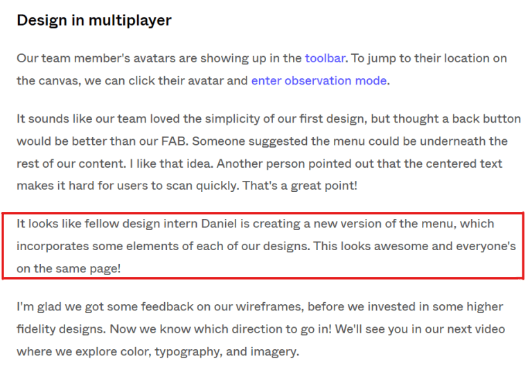
In the video, this section shows a team collaborating on a project and making changes that everyone can see. To a person reading this section, this information is impossible to understand without context, especially when there are changes being made to a visual design. The reader isn’t given an example of how to do this, but is rather invited to imagine unknown changes being made to the things they’ve done in the tutorial.
There are also sections like “Get components/Use components” that just leave out the information you need to continue doing the tutorial. Even in the video, they explain to paid users how to do the steps, but for free users, they post a pinned comment on YouTube about how to do what they’re doing, including an additional 8 steps of text that are never even mentioned in the tutorial on the website. It was at this section of the tutorial that I remember feeling discouraged because I couldn’t do any of the steps after without those 8 missing steps.
The second problem is that, even though the text comes directly from a video with visuals about what they want to teach you, the tutorial sports no visual representation of what’s being taught. Not every guide needs visuals, as simple text instructions can be clearer than multiple minutes of video on specific topics. However, in this case, I think it’s important to consider the audience that this guide is tuned for, as well as the content that’s trying to be taught.
As a technical writer for a written tutorial, I don’t think writing is necessarily the most important thing about what you’re presenting to the audience. Making sure that you transmit the best/most important information should be your number one priority when teaching something, whether you’re writing, in a classroom, or talking in a video. If you have to add pictures or video or do a dance, you should do whatever is in your power to make sure that the best form of that information is delivered to your audience in any way that you are capable of delivering it.
Smaller Issues
Besides these overarching issues, there were also patterns of problems with how the information was presented through the text. For example, numbered steps sometimes include information that isn’t actionable. This can be confusing to the person learning as the numbers in a list usually imply something like: “first, do this. second, do this.” Steps switch from having actionable steps to having information that should just be included after the steps.


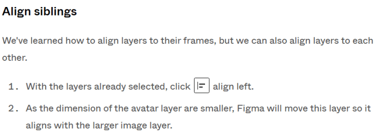
Steps also include actions that are unclear. For example, in the first image above, one of the steps included says “Select the rectangle tool to create an image for a post on your app’s home page.” After this step, the user still needs to click inside the frame and drag a rectangle to represent an image in the app, but the tutorial fails to mention this. Personally, I think it’s intuitive once you’ve clicked on the tool, but you can’t necessarily assume that for everyone. Something that’s intuitive for one might not be for all. Including every detail that needs to be performed in a step is critical to writing a guide for someone who has never used your product.
The copy also contained minor errors like repeated text.
Positives
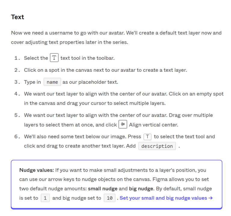
There are things that I think could be better about this tutorial, but I want to make sure to mention the good things that this tutorial does, because it does do a lot of them. For one, the formatting on the page is exquisite. I noticed this across Figma’s website, but having icons and text pop out like with the Nudge values note above really brings a character to the text that wouldn’t be there without it.
There were also many parts that I didn’t think needed altering in any way, including some of the steps themselves, sentences describing aspects of Figma, or even just entire sections themselves. For one or two of the sections, I went back to after writing my own version and found that the original was just better than how I had worded it, so I ended up going with the original wording.
While I think there are plenty of changes that could be made to the tutorial in general, all it really needed was a person or two to edit the original author’s work and add some additional media.
Things I Changed
There were a couple major objectives I outlined before putting any words down:
- Introduce the tutorial with a visual of what we’re going to make by the end so the reader has a mental roadmap of what will be taught
- Alter copy to better interface with an audience reading instead of one who is listening/watching demonstrations
- Firm up or cut sections entirely so only content useful to a new user is presented
- Make sure each step has actionable items the reader can do themselves so they can learn through action
- Require actionable steps to chain together with the prior and next sections
- Include visuals of what’s happening each time we have steps that change something visually
These were the ideas I started with. They seemed to make sense to me, but I wanted to peruse some other guides to see what others did in their guides. Surprisingly, I found that some of Figma’s other guides were strikingly similar to what I was envisioning. For example, this guide currently on Figma’s website utilized many of the points I outlined for myself. I even discovered from Figma that you can make high-resolution gifs at small file sizes, spurring me to research heavily into how to make high-quality gifs and prompting me to write another guide.
Using a mixture of the tutorial above, the original tutorial, and the things I outlined for myself as wanting to change, I created a new guide for Figma which I posted here.