Ever wanted to design an app but had no idea where to start? Or maybe your team needs to collaborate on designs, and you’re looking for the right program to meet your goals. Then Figma, and this guide, is perfect for you!
With Figma, you can collaborate on designs for user interfaces with multiple team members simultaneously (think Google Docs, but for UIs). Whether you’re a developer, designer, writer, or manager, Figma is an excellent tool for connecting teams designing interfaces. If you don’t know where to start, download Figma here, or you can use it in your browser at figma.com.
This guide will walk you through opening the program for the first time to making a low-fidelity wireframe for your very own social media app so you can use Figma in your own projects.
When you first open Figma and start a new project, you should see something like this:
In the center of your screen, you’ll see the canvas. The canvas serves as the backdrop for your designs. This is where your frames, shapes, text, and images will live.
By default, the canvas color is set to #E5E5E5, which is a light gray/white in HTML hex code. Since everyone has their own preferences, we’ll start by seeing how to change the canvas color.
You can also swap the sidebar colors between light, dark, or even your system theme to better match your canvas.
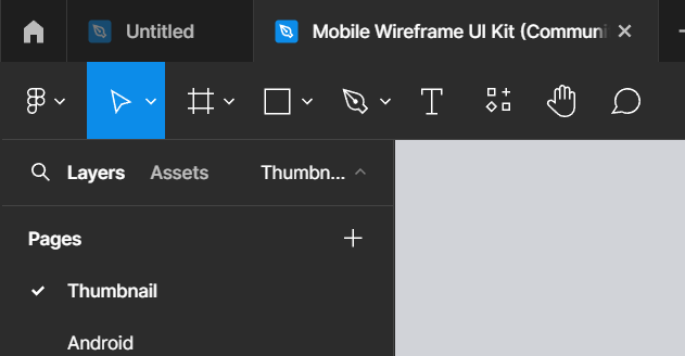
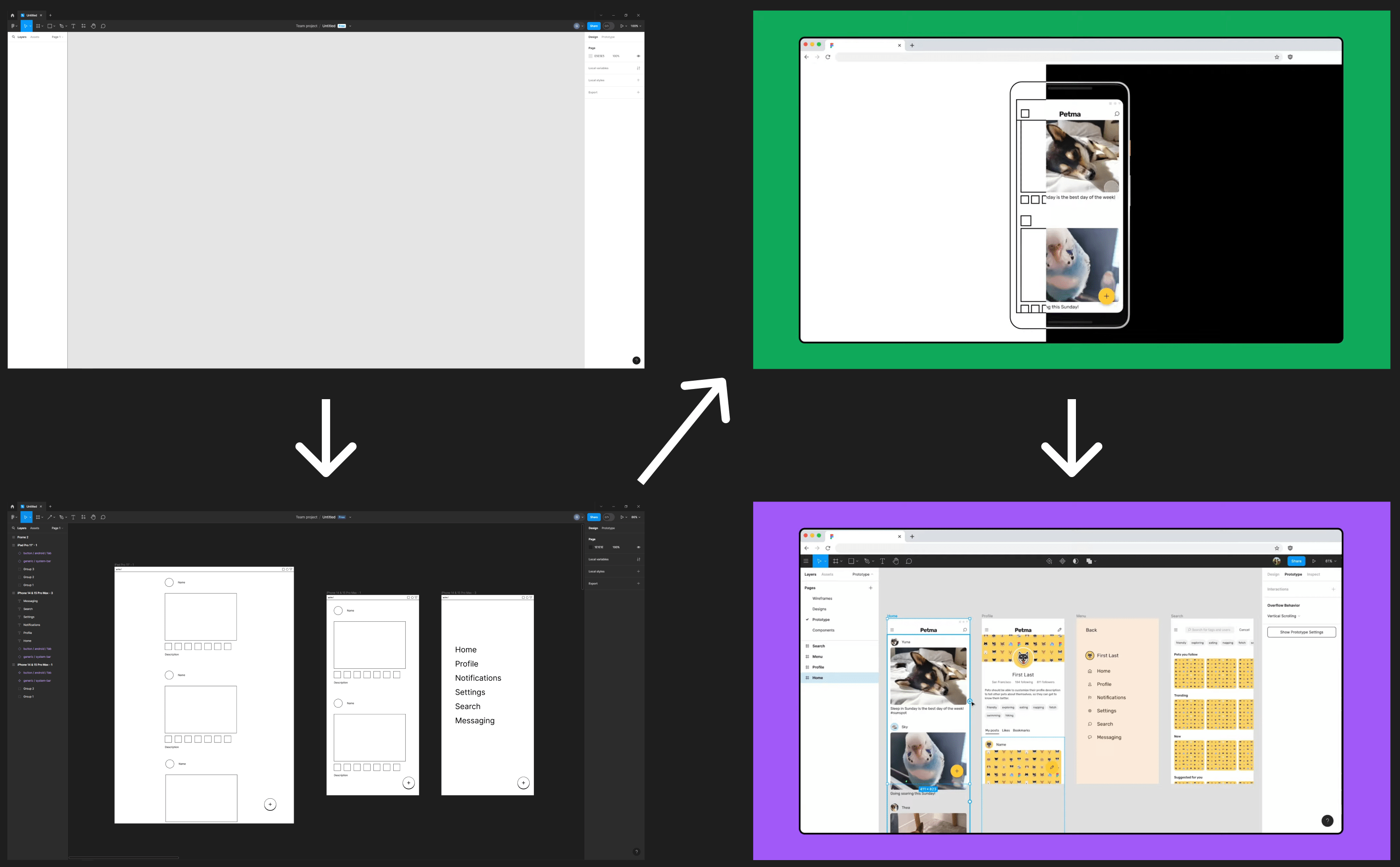
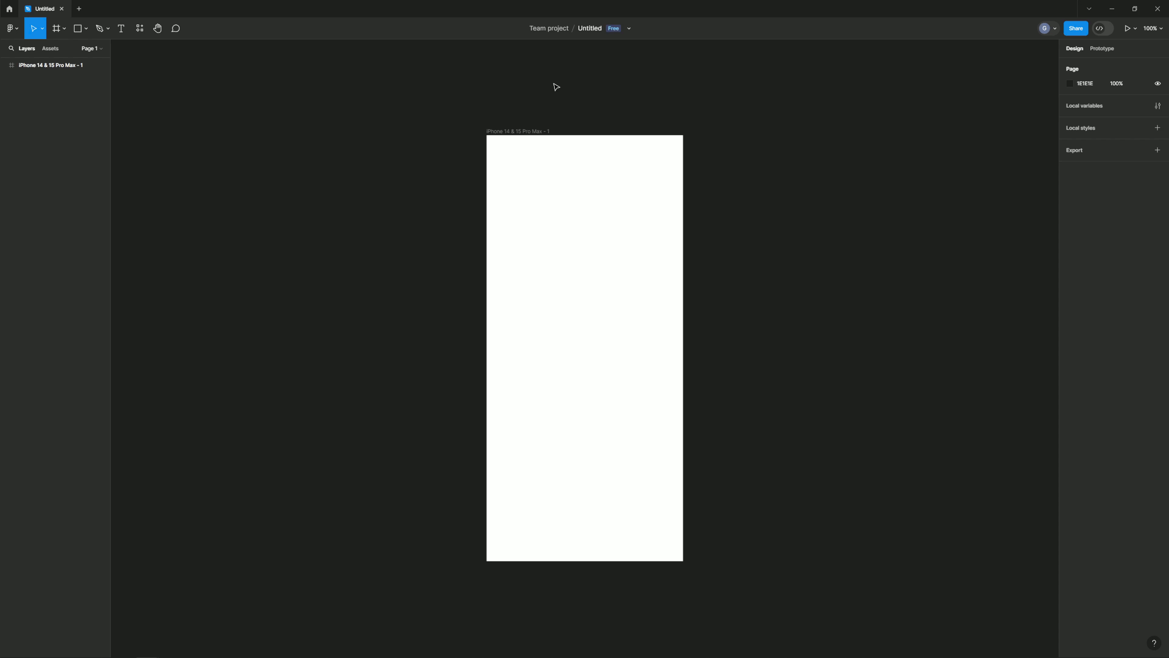
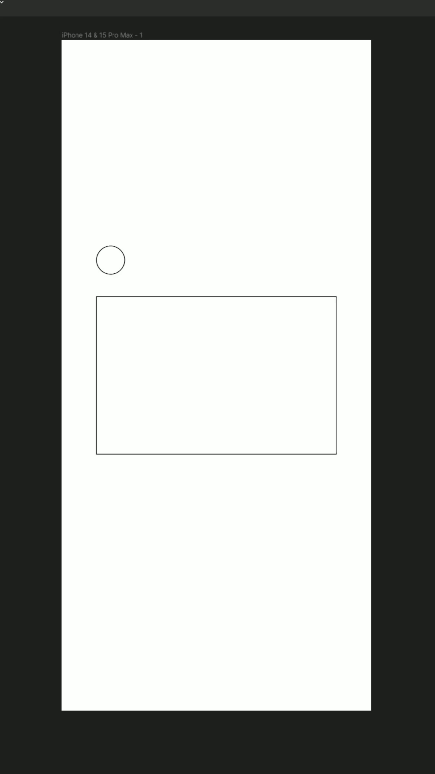
The first thing we want to do is create a frame to house our designs. Creating a frame will make things much easier when we want to move the elements inside it and help us stay organized later.
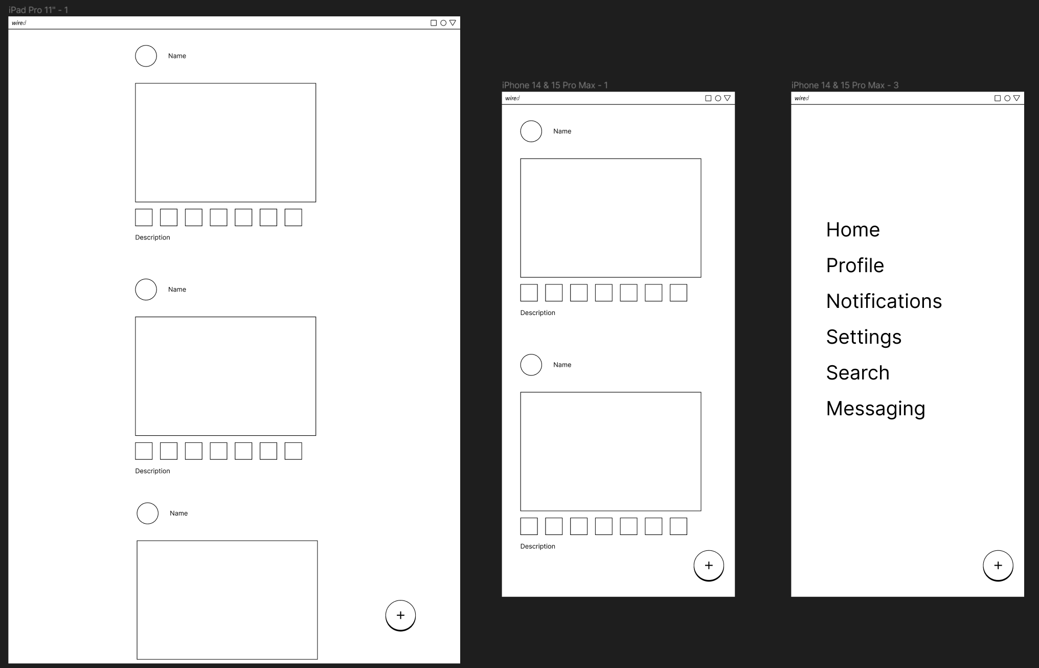
Another great thing about frames in Figma is that we can choose a preset that is the same size as many popular devices. For our project, we’re going to set up our design in an iPhone 14 & 15 Pro Max screen.
We now have a frame in our canvas with the exact size we want for our app. In the left sidebar, there is now a layer called “iPhone 14 & 15 Pro Max – 1.” This sidebar will help us organize the frames and elements we’ll create later, as well as bring them into focus if we double-click on the symbol left of the text. We can also rename the frame by double-clicking on the text in the layer menu or in the canvas itself.
Frames also don’t have to be a specific set size. After selecting the frame tool, you can click and drag a frame to any size you want. You can also enter precise dimensions or see the size of a preset by clicking on any frame and looking at the numbers in the boxes next to Width and Height (W and H).
Note: Now that we have added something to our canvas, we can now maneuver around. Pressing Ctrl/Cmd while scrolling will let you zoom in and out of our frame, while holding your middle mouse button and dragging will let you move around the canvas.
Before we start making elements of our UI, we first have to learn how to make shapes. We’re going to start by adding a rectangle to our frame.
Now that we have our rectangle on the canvas, let’s change its dimensions. We can change it so that it’s any size, but for now, let’s change it to have a width of 334 and a height of 220. There are two primary ways we can adjust its shape, size, and position.
If you want to visually adjust it, you can drag from the corners or sides to make it larger or smaller. To move the rectangle, just click and drag from anywhere inside the shape.
You can also adjust the position or shape by clicking once on the shape or its corresponding layer in the sidebar, then changing the numbers next to the X, Y, W, and H.
Putting a rectangle inside of the frame will make that rectangle a child to that frame. We use the analogy of parents, children, and siblings to describe relationships between layers.
If you’ve done some programming, you may already know these kinds of terms. Don’t worry if you aren’t, though. Here’s an easy rundown of how these relationships work.
Depending on the dimensions of the relevant components, Figma will automatically detect and parent items moved in and out of relevant layers.
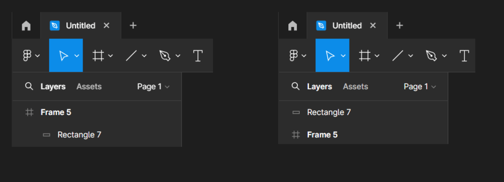
The rectangle will now be positioned in the center of the frame. If you select the rectangle again and hold the ALT key in the frame, you can see the exact distance from each side of the frame Figma has positioned our rectangle.
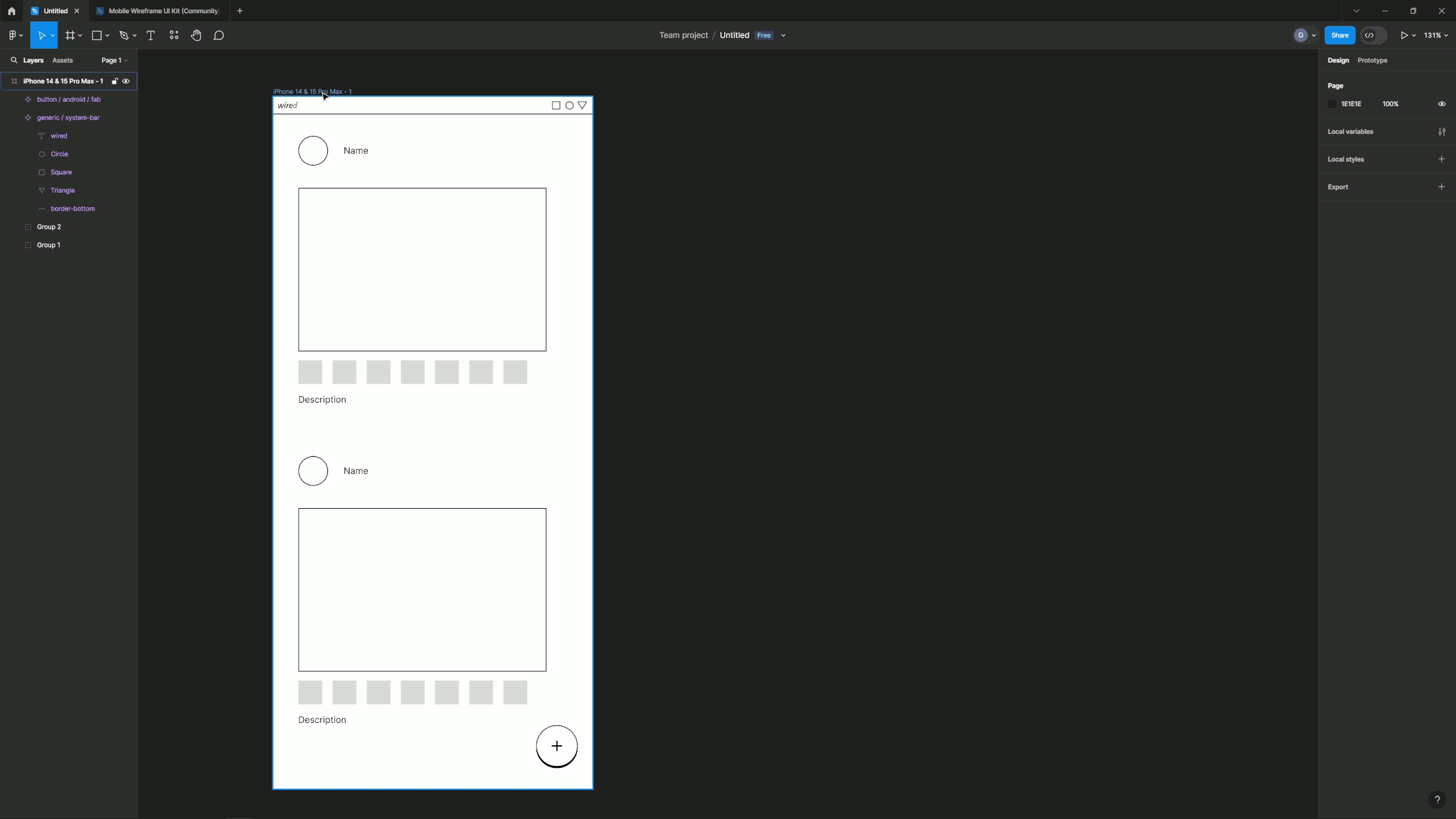
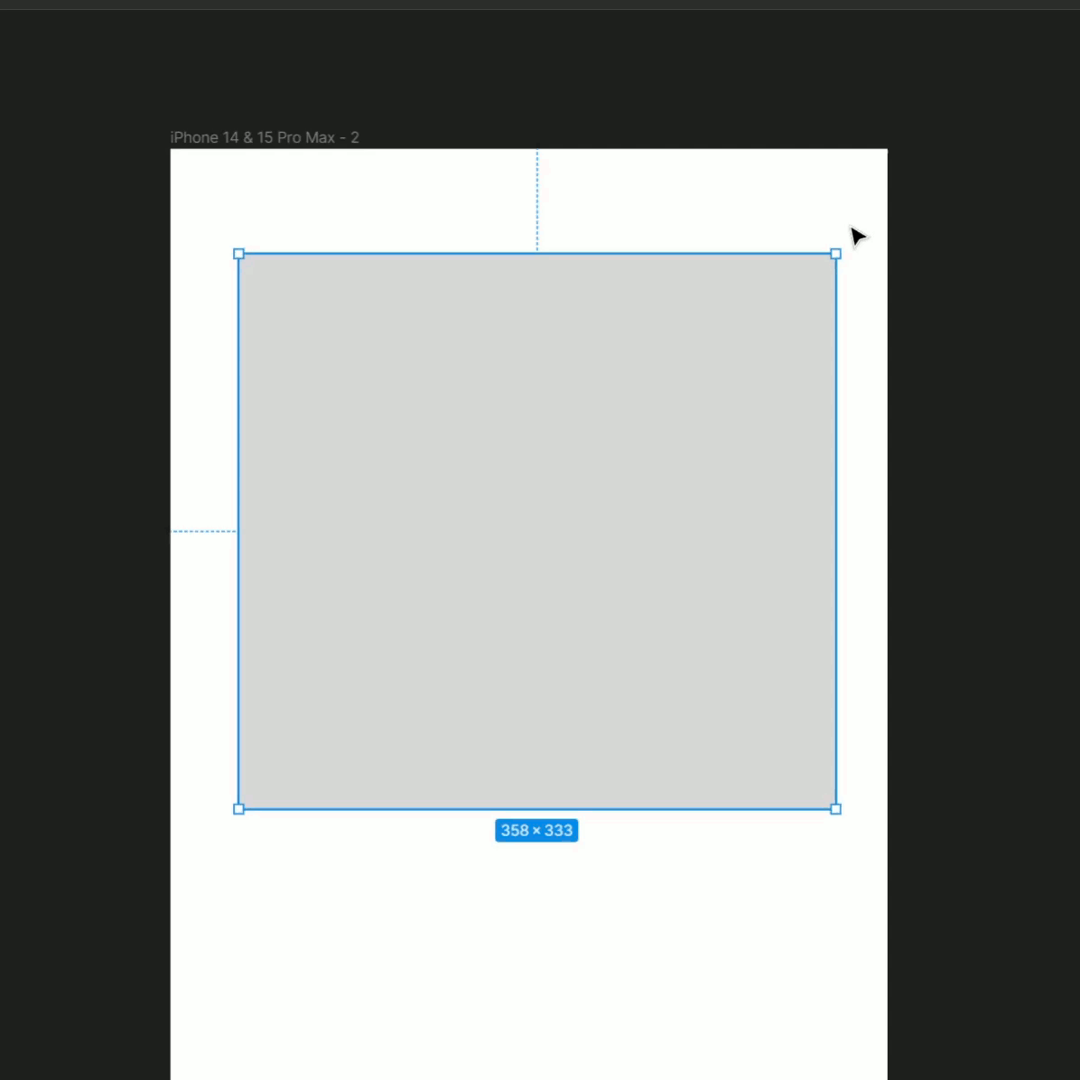
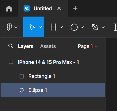
Now we’re going to create a shape that will hold a user’s profile picture or avatar for our app.
Because we used the shift key to make it a perfect circle, the symbol to the right of the W and H in the right sidebar will now be toggled on. This means that if we update one number, the other will update with it to stay the same.
If you didn’t get exactly 30×30, you can use up or down on the arrow keys while in the W or H fields to nudge the values up or down.
Some fields in Figma also accept equations – you can use equations to resize layers by adding, subtracting, multiplying, or dividing the existing value. Because our 30×30 circle is a little smaller than we want, let’s increase it to 40×40 by using an equation.
Shapes will automatically fill with gray when they’re created, but we can change the interior, known in Figma as the fill, to be any other color, a gradient of colors, or even an image or animated gif.
We can also change the outline of the shape, known in Figma as the stroke. We’re going to add a stroke and remove a fill from our two existing shapes so our final output will look more like a wireframe. To do this:
You can mess around with the colors of the stroke to be whatever you like, including an image, gradient, or even a video (if you are using the Figma Professional package).
Switch it up! You can quickly change a layer’s fill to a stroke by pressing Shift + X. This removes the layer’s existing fill and applies it as a stroke instead. You can then click the swatch in the Stroke settings to choose another color.
We’ve learned how to align layers to their frames, but we can also align layers to each other.
By doing this, we align our circle’s position to our square. Figma will always align smaller layers to larger layers automatically.
Now we’ll add a username next to our avatar. We’ll create a default text layer now and cover adjusting text properties later in the series.
Next, let’s align the “name” placeholder text so it’s centered to the center of our avatar.
Nudge Values: If you want to make small adjustments to a layer’s position, you can use your arrow keys to nudge objects on the canvas. Figma allows you to set two default nudge amounts: small nudge and big nudge. By default, small nudge is set to 1 and big nudge set to 10. Set your small and big nudge values →
We want our users to engage with our app through comments, likes, and saving posts. Let’s make some icons so users can do that.
We now have a simple representation of a button under our post that we’ll flesh out later. If you want, you can also remove the fill and add a stroke. However, in my example GIFs, I’m going to keep them with fill to differentiate them from our other squares. We’re going to make more of these buttons for the other features our app is going to have, so we’re going to make more icons from our original.
If you’re computer savvy, your first instinct may be to copy and paste to make another square. While this would work to make another square, Figma offers similar solutions while letting you keep the contents of your clipboard free. That means if you have something you want to copy into Figma, you could keep that while still being able to clone Figma’s elements.
There are two ways we can go about this:
Or:
Tip! If you want to change the set amount of space between each duplicated square, select them all and look underneath the angle option in the right sidebar. A new field should be available to set how much space you want between the new clones.
All these layers make up a single post, so we want to make sure these objects stay together. There are two ways we can group or organize layers: groups and frames.
While frames and groups look similar in the layers panel, you should think of groups as a way to bundle together elements that you want to move together. Frames, on the other hand, are designed to be distinct containers, like screens in a mobile app or individual slides in a presentation. This is because frames have a multitude of different properties and features that groups do not have.
Frames
Frames can have their own dimensions and properties, some of which can affect the layers within them. They allow you to access features like constraints, auto layout, prototypes, and more. We’ll learn more about frames and their properties later in this series.
Use frames to create distinct containers, like screens in a mobile app design or individual slides in a presentation.
Shortcut: Ctrl + Alt + G (Windows) or ⌘ Command + ⌥ Option + G (Mac) to frame your current selection.
Groups
Groups allow us to move around a collection of layers without having to select each layer individually. Groups don’t have properties of their own; only the layers inside the group do.
Use groups to organize your layers or apply properties to layers in bulk.
Shortcut: Ctrl/Cmd + G while selecting multiple layers.
Tip! You can also nest frames within other frames, so you can use frames for design elements like buttons, nav bars, or newsfeed posts. If you’re familiar with web development, anything you could put in a div could be a frame.
Let’s group together our post so we can move it wherever we want in the frame and duplicate more to make it like a normal social media news feed.
Now, if we want to shift the position of this group of elements within the frame, we can move them without having to worry about positioning each piece the exact same amount.
If you ever want to switch this group to a frame, or a frame to a group, just look above the position coordinates in the right toolbar. You should see a selector next to “Group” or “Frame” that you can switch to whichever you prefer.
Our app is looking better, but there are still many core elements that we’re missing. We could go through and make each of these elements using shapes, text, and drawing tools to fill out other parts we would need for our app, or we could use components as substitutes to speed up the process.
Components are the building blocks of our design. They could be basic UI elements like buttons or icons, or more elaborate compositions, like toolbars and menus.
Libraries are collections of components and styles. You can use libraries in Figma to use prebuilt components in your own files or share your designs for others to use.
We’re going to utilize a library of prebuilt components to fill out some of the components we want to use in our app. If you have Professional (subscription to Figma), you can follow the steps in the official Figma guide here. For our purposes, we’re going to assume you have the Starter version of Figma (free).
Libraries for Figma can be found at www.figma.com/community. We’re going to get this library and utilize some of its components in our project.
We should now have a new tab next to our original project with the library. Like many projects in the Figma community, this project opens to a “cover” with a title and background visuals. To navigate to the main content of this library, look in the left sidebar where you’ll see a category heading “Pages” and the categories of Android, iOS, and Generic.
Let’s add a few components to our project.
You can do this same process with any library you find in the Figma community. Many companies, such as Apple and Google, publish their own libraries of components you can use for your own personal projects. Be sure to take a look around at other community files if there are any other ideas you think would work well in your own version of this project.
For now, we’re going to add another component from this library, this time from the Android section, to our project.
We’ve now created two instances of components for our project. If you copied the correct assets from the library, you should see each instance when you switch from the layers in the left sidebar to assets. If you don’t see one or both in the assets section, make sure to follow the steps above, or, if you’re feeling brave, you can right-click on the version you copied and select the “Create Component” option.
Any changes you make to the main instance of a component will be universally changed throughout the project, as long as you do it within the group. That means you can add or remove things from the main instance of our status bar, for instance, and every other status bar you have in the project will change.
Let’s see this in action.
In the duplicated iPhone frame, you should see that the last letter of “wired” has also been deleted. You can mess around seeing what changes save over by adding/deleting text, adding/deleting shapes, or any other changes you wish to make.
Now that we’ve completed the third frame of our wireframe, you should have something on your canvas that looks like this:
And that’s it! You’re now familiar with the basic aspects of Figma. Congratulations!
If you want to continue making this project by replacing our low fidelity wireframe with a high fidelity version, or if you just want to keep learning different aspects of Figma, you can head on over to the official Figma website.
Note: This is my rewritten version of the first part of the official Figma tutorial. If you want to see the original version, or if you’ve reached the end here and want to continue with the project, check out the official version and its extended parts here.