UX Writing Showcase
Language is an awesome tool. It lets us communicate to each other unknown dangers, learn skills which we use to survive, and even teach lessons to people who haven’t been born. Or, we can use it to do something simple, like showing someone you care or getting someone to laugh. Language connects us and elevates us.
But like any tool, language can be misused. Such as in “The Boy Who Cried Wolf,” the boy breaks the trust others place in him by misusing his words so they do not come when he really needs help. Or sometimes, you try to tell something to someone, and they come back to you a week later telling you about the exact same thing because they zoned out while you were telling them about it. There is an art to deploying language to an ear or to paper (as well as listening and reading those words).
While writing itself usually takes the form of communicating information to others, UX writing must communicate information concisely while also acting as an obvious tool to others. In a way, the writing becomes a handle of a tool, or monkey bars on a playground. Good UX writing must be writing that’s so intuitive, anyone can look at it and understand what to do with it. However, if that same text is unintuitive or doesn’t communicate what a user wants, that fundamental disconnect can cause people to stop interacting with the product entirely.
My primary goal writing for users is to make text as easy to digest and usable as I possibly can make it. In a lot of cases, figuring out what’s usable is an intuitive process, utilizing your own experience as a user and researching what others say to find the best words for the task. But I also try to keep a couple key principles that I learned from Strategic Writing for UX by Torrey Podmajersky in mind when writing text for users.
-
Be clear
-
Be concise
-
Be so intuitive as to be nearly invisible
-
Keep a consistent voice
Each of these is paramount to UX writing. In her book, Podmajersky includes a quote at the beginning of a chapter that I think many people understand intuitively: “They may forget what you said, but they will never forget how you made them feel.” Without any one of the principles above, your users will feel that subtle friction and harbor negative feelings toward your product, even if it’s something that they could actually use. I want to help bridge that gap between a company and its users using the delicate tool of language.
It’s one thing to talk about making an experience, let me show you the words I would choose to live up to the principles of good UX writing. Recently I took on a fifteen day UX Writing Challenge to do exactly this.
Below I’ve showcased what the text could look like in some high fidelity wire frames cooked up in Figma.
Day 1

On the first day, I was excited to get to work, so when I saw this prompt I got a lot of different ideas I wanted to test. The first thing I noted was there were many ways to approach the text depending on what services the airplane company is capable of or what services the company wants to provide. This is something that would likely be discussed before text was written, but I figured it would be fun to tackle multiple different situations.
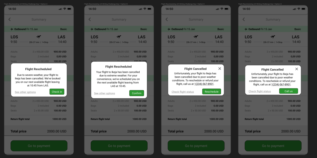
In the first two options I wrote up, I reschedule the flight automatically for the user to a time closest to their departure date, then give them the option to check in/confirm this or check other options where they can call a help desk, start a chat, see flight status, reschedule themselves, cancel the flight entirely, or whatever other options we want to present to them through the app.
In the last two options, I simply tell the user why the flight has been cancelled entirely, and present them with options on how they want to proceed. The first two options I view as the airline being able to devote more resources to the app development (automatic systems, extra screens, etc.), while the third and fourth are options that would require fewer resources. Reschedule in Option C would redirect the user to scheduling in the app (which would likely already be built out), while “Call Us” would skip the app entirely and route users to call a system all airlines already have with the phone app instead of routing them anywhere else where something could break.
In terms of content of the text, the first sentence of every option varies in phrasing, but keeps exactly why the flight is being rescheduled/cancelled and the fact that’s why the information is being presented to the user. This information bears the most importance to the user and, along with the title, needs to be presented immediately. Each option then presents what action that has been taken (rescheduling in Option A and Option B) or what logical actions should be taken by the user (manual refund/reschedule in Option C and Option D).
I played around with different button combinations and settled on slightly different UIs for the two resource situations. For the flight rescheduling, because I am presenting time-sensitive information that I want the user to acknowledge in some way and present the user with two options that cover everything the user could want, I didn’t include a way to exit the message without selecting one of the options I presented. In the second option, because we are removing the “See other options” button, the user can leave the message if they have called already or don’t want to reschedule.
I also varied the tone of the messages from a simple concise message in Option A to a more apologetic sentence 2 in Option B and then again with a more apologetic sentence 1 in Option C and D, depending on what we as a team would want the voice of the company to be.
Day 2

Day 2 and we’ve already hit our first trap. When I asked others about this prompt, the first thing I heard is that this sounds like you’re writing a targeted advertisement to a certain consumer for an app. Looking up examples of others’ work for this day also yielded similar results, although some did catch on.
Although this screen is promotional material for an app, the screen is going to live inside the app itself and not as external promotional content. “Promotional Screen” here could be misinterpreted to mean a screen of promotional content.
Everyone who has used apps knows what promotional screens are, although many might not be able to label them as such. Here’s an example of one I found in the Figma community:
Because it was Day 2 and I was still ready to pump out UX text, I decided I would tackle text for both the in-app promo and an example of what an email might look like for that same scenario.

Here we leverage more casual language (“we got you,” “game time,” “let’s do it”) to connect with our audience of sports fans. We also want to take the most important features listed in the prompt and use language to boil them down into their most condensed and interesting form to get people into the app.
The prompt tells us that the app “lets a user choose teams, send game reminders, real-time score updates, and [watch] highlight videos.” While this is the raw content, we want to shift the wording slightly to use language used throughout the market to advertise the type of content we have. “Send game reminders” could become something like “Get gameday reminders,” but instead of focusing on the idea that we can send them these notifications through a push-style notification, I want the focus to be on the content. “When and where to watch” very simply tells the user that we have schedules and compile information on where the games they care about are broadcasting from.
Terms like “highlight videos” work, but personally, I would word the copy to compete with the overall market. Social media apps also show users top moments from games using algorithms to hone in on what users are interested in. We want to represent to users that we will compete with social media by compiling content that users are interested in for each team and each game so that instead of social media, users can find that content on our app. “Best clips from each game” will imply this to younger users while also retaining the same meaning as “highlight videos” for older users.
For the button text, instead of continue or next, I went with a more action-y/casual “Let’s do it” to get users into the app, but something like “Get started” could work as well.
The email version features body text that puts the same information in a sentence instead of a list like the first. We also swap the button text out for download buttons.
Day 3
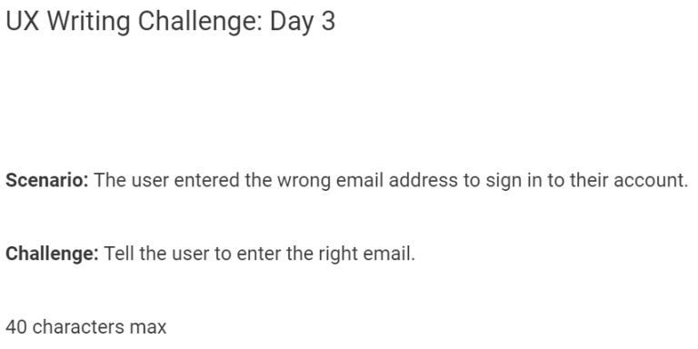
Day 3 appears simple on its face, but there are a couple of things you want to keep in mind when you’re writing a message like this. First of all, when you’re dealing with email and accounts, you’re dealing with security for not only your own platform but every platform that email is tied to. So you can’t say outright that “the email doesn’t exist in our database,” because that opens up the account holder to a ton of security concerns. Second, we need to actually communicate what is happening to the user without making the text so unspecific they don’t understand what went wrong.
So, our goal is to give enough info to the user while also keeping dangerous info out of evildoers’ hands.
All that for a simple error message? That’s right! And that’s why you need someone experienced enough in technology and writing like myself to handle all your writing needs! (https://www.linkedin.com/in/grahamlinley/)
Anyway, I came up with two options with this number of characters.

Option A is a little more specific with what information we’re presenting to the user while not being so specific that attackers will know whether there is an account made at our website or not. We’re saying “redo the email field” without giving more information.
Option B is even more generic and the default security option for most websites. We’re not telling the user exactly what info they messed up; we’re just telling them that they should redo the process in general, which they’re going to have to do anyway in Option A. Option B hides more info at the cost of shielding more information from both attackers and the user.
Personally, I would advocate for Option B as I think shielding information from attackers is more important than presenting super precise information in this case. However, I think Option A more specifically addresses the prompt.
Day 4

I varied almost everything between the different options in this scenario: button placements, button text, title text, promo message content, and centering. Pretty much everything is different from option to option.

The main thing I would note is that in Option A and C, I included the price and a Sign Up button, versus Option B where I included a promotion to get customers and a “See Details” button. The Sign Up versus See Details button was a hard-fought war in my head, one that I am still nearly 50/50 on. On the one hand, Sign Up as a CTA is more direct, and since the offer is already in the promo message, the user is less likely to back out. However, on the other hand, “See Details” is less committal and potentially opens the user to more information that might sell them on becoming a subscriber. In the end, I think I would advocate for See Details as a way to get people in the door . This is because Sign Up, even if it leads to a page with more information, might deter users initially from clicking because it’s a little more committal.
The body text also differs vastly between the options. Body text will probably largely depend on what is most enticing to new customers that the store is willing to offer. If the price of the subscription is enticing and it’s not like $500 a month, customers will be interested. If there’s some deal where customers can try out the service with low stakes, then I would promote that in the text.
Otherwise, I like the idea of highlighting the drive and lines as pain points in the first line while the user is actively in the store, as the drive and parking are probably fresh on their minds. Reading about a subscription service that lets them cut out that time would likely be enticing.
Day 5

This is another challenge that will depend on the technology available. Since most modern programs will have some sort of autosave, I assumed that our app would have autosave as well.
I want to note that regardless of whether there is autosave or not, we could likely get away with not displaying any message here. I think if a user has their phone randomly shut off while they’re editing something, there’s an expectation that either data is automatically autosaved periodically and there would be no need for a restoration message, like Google Docs or some apps already do, or if there is manual saving required that the data is gone.
But, assuming that we have an app that is more in line with something like Word or Excel where we have an autosave that the user can manually choose to load or not load, I made a couple different options we could go with.
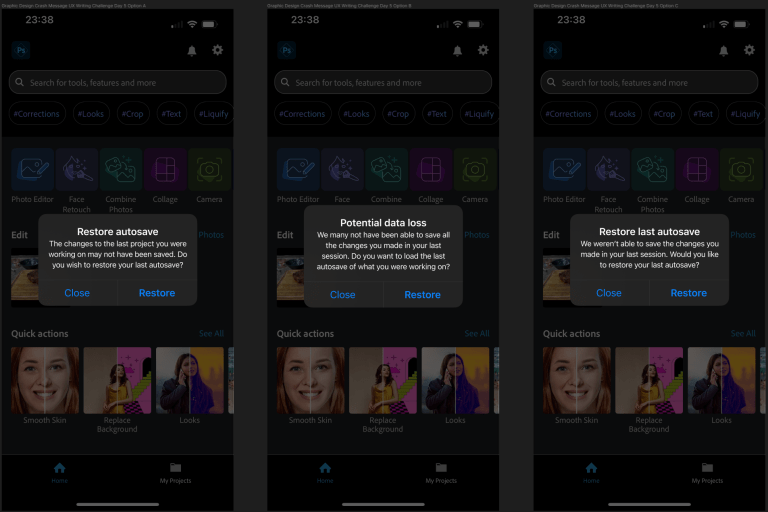
Option A is the most minimalist option, while Option B has similar content but softer body text tone with a little more accountability. We could also mix the first sentence of A and the second of B for full active voice or the inverse for full passive voice, depending on what we feel sounds better.
I’m not a huge fan of the title in B as it has an edge that “Restore Autosave” doesn’t have. However, I kept it as an option as I think that edge may be deemed as needed in an app environment like the one we live in where popups like this one plague us with irrelevant information all the time. A hard title could pull users’ attention to the importance of the message, as finding out that all the changes they made were deleted because they exited out of a message they didn’t even read. “Restore autosave” is standard enough, though, that people could see it out of the corner of their eyes when they’re about to close and know what the rest of the message says without reading it though, so I would recommend either Option A or C’s title.
Day 6

When I initially wrote this text, in my mind, the driver was navigating to wherever they were going and would get a popup in their map app that warned them of the danger. I think that’s still a valid interpretation of the scenario, but after rereading the prompt I realized that a push notification to their home screen from a system app would address the scenario more accurately.

For the headline, I went with all caps warning to stress the importance of the message.
For the body text, I think as long as you get some variation of “fire nearby” and “driver beware,” most people will understand. Because “road closures” were specifically mentioned in the prompt and there was no mention of the fire being a wildfire, Option A’s body text would likely win out of these two.

Because I liked the idea of a warning on a map as well, I added a little bit more to the body text and also designed a popup for a map app, playing around with different box widths, button widths, capitalizing button text, and bolding titles in two different options.
Day 7

The message itself I think is pretty simple and there’s probably a million different ways you could handle depending on the state of the game, score, what sport it is, players involved, etc. Here’s an example of how I would handle one.

We include the player that scored, the time left in the match, and the total score of both teams.
Day 8
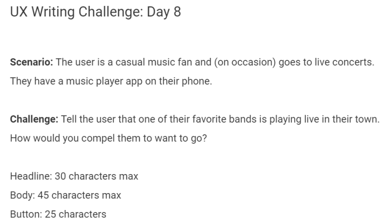
For this scenario, I researched a couple of different methods that music apps currently handle the UX for notifications. I use Spotify a good amount and I’ve seen a lot of popup notifications for things like albums, concerts, new releases, etc., like the middle example in the image below, but I’m also familiar with the banner method on the left.

I’ve personally learned not to like the banner just because it never disappears, so my mind defaulted to writing a popup like the one in the middle. However, I found in my research that people really hate the popup notifications in the middle, so even though that’s what I envisioned when I wrote the text, when setting up the layout in Figma, I called an audible and went with a banner instead.
Initially, I only had written the text in Option A as I liked the casual tone of the title mixed with the information of the day of the concert, which left more room in the body for text.
But after playing around with the formatting a bit, I think seeing the band name bolded in the title might be more eye-catching to users as they are going to be familiar with that specific name. This could easily be something we could A/B test to see which was more effective.
Day 9

Everything about this message is going to depend on where it’s going to be displayed. I only realized this after I made the layout for this message, as originally, I had a headline and body that was a separated version of what was in Option B. However, when I was looking at examples of how this text was implemented, it was almost never in a Headline/Body layout.

After making the layouts for this scenario and Day 5, I learned an extremely valuable lesson for UX writing, the opposite of which was drilled into me through writing at school and other writing jobs. Just because you’re given a limit doesn’t mean that you have to write that amount.
Option A perfectly illustrates this. If you weave together “Card expired” with a yellow warning and a gray out of the “Pay Now” button, the customer will understand that they will have to update their payment to continue instead of having to use ~75 characters to say the same thing. Just because there’s less text doesn’t mean your message isn’t getting across the same.
Day 10
We want to do exactly what the hint is suggesting by providing the user with a really good reason to enter their personal information. The way we do that is through a mixture of text that suggests we need the information to find relevant deals for them, combined with a visual representation of not being able to display the information in the UI. By showing them the unloaded UI behind the popup and having “Find local cars” or “See Local Prices,” we’re implying we can’t load relevant content without them trading their information for ours.

The body explicitly tells the user what they need to enter and what they’ll get if they do.
For the button text, there are two philosophies we can go with. The hint says that “persuasive button copy can help you close,” however, we should ask ourselves what exactly will persuade a customer in this instance? For me, the thing that is most convincing is the idea that the site cannot load without the information, as the UI setup implies. We’re not trying to push the user into doing something or honeypot them with sweet language; we’re just showing them that we could load content, but it would be meaningless without the information they would give us. This is why in Option A, I just go with “Search” as the button text. The directness and non-marketing copy in this instance is what makes it persuasive.
On the other hand, we can do what the hint is really suggesting and use more marketing-oriented language to suggest if they click it they’ll get what it suggests. “Find Local Deals” reiterates that their zip code is going to be traded for relevant information, while also using “find” to imply that the deals are hidden and “deals” to imply that the prices are better than they’ll be able to find elsewhere.
Day 11

While the hint text is correct to say that the text for this scenario should keep the user as the priority, SEO in my mind is a very close second. The text can’t be useful if it’s never seen.
My first attempt at a meta description frankly lacked any utilization of SEO: “Hassle-free prescription lenses delivered directly to you for $10/month. Easy to customize subscription frequency. Cancel anytime. (A deal anyone could see.)” I thought this would be a mixture of useful information for the product while mixing in fun language to make the offer more interesting.
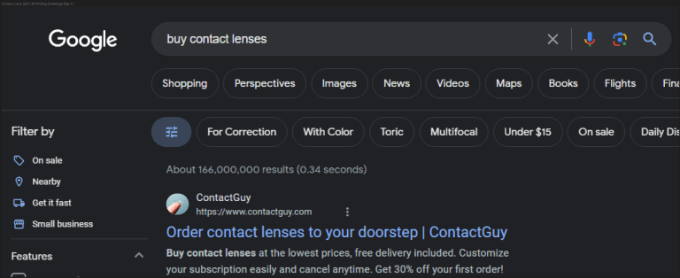
But after searching Google for the phrase “buy contact lenses online,” I realized that the text was too “fun” and did not do the things that good SEO text should do.
The first thing I noticed in my search for order contact lenses online was that “order” and “buy” were in every result. I decided to include both by putting one in the title and one in the meta description. I also found in my research that they were interchangeable as what Google recognizes (as in you can type “order contact lenses” in the search bar, but the word “buy” would be highlighted in the meta description), but I had enough characters left in the title to include both.
The title is how we want to merge both SEO writing with UX writing. You include the important SEO words including “order,” the product itself (in this case “contact lenses”), and the company name, but you also have the imagery of ordering something from someone else and getting it delivered in the most convenient place it could possibly be delivered.
For the body, I hit as many SEO terms as I could. Things like “low prices,” “free delivery,” “custom subscription,” “% off,” and I imagine people really fishing for deals might include “first order.” I also included as many things to entice the user as possible into clicking, although I doubt a subscription service would be discounted this heavily in reality (free shipping, 30% off first order, custom subscription, free cancellation, and low prices).
If we couldn’t use the deal language, we could substitute popular brand names of contact lenses (lowest prices on x, y, and z).
Day 12

Another simple error message requires a little bit more than the 45-character limit would imply, although not as much as Day 3. People will abuse signup systems by entering fake-sounding names with fake emails to sign up for websites all the time (cashiers at Safeway may or may not know me as “Safeway Boi”). To make sure that as many real people as possible are signing up, this type of fraud detection would likely be paired with a ton of other methods to detect if the user is fake, including barring certain emails, bot detection, associating “heavier” information like credit card info/social security/etc.
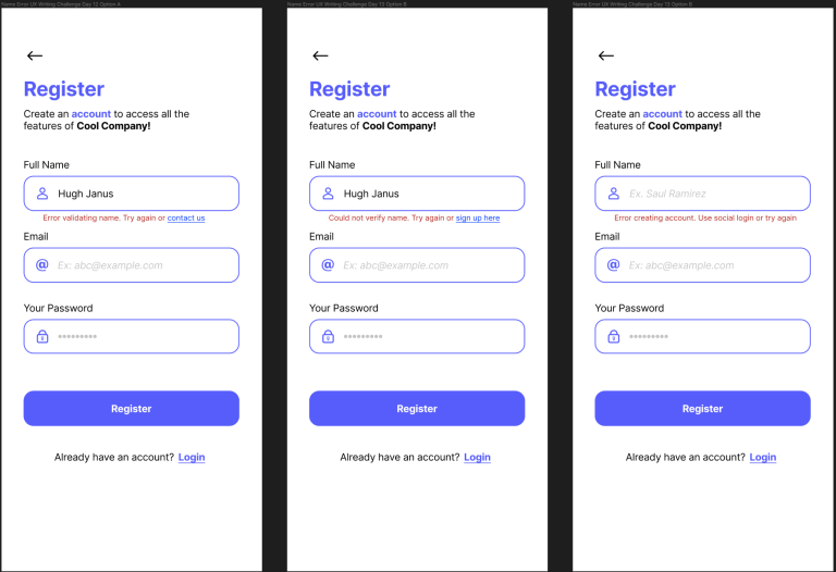
Depending on how serious we’re going to be with verifying the accounts, we can take various measures through text to keep out these evildoers.
For my example, I’m going to assume we’re fairly serious and have resources to handle customers who want to sign up with their name anyway. So, say we’re handling account creation for a financial institution that doesn’t want to let fake names in account creation slide. When the fake name is entered, we’re going to first give a generic “Error validating name.”
We could leave it there, and leave it to the user to enter a real name. However, this will leave users that actually have the name stranded as they will have no recourse to getting rejected by the automated system. For the people trying to use fake names, I show mercy on their souls this day and prompt them to try again, giving them the decision to enter a real name or leave. For the person with the real name being detected as fake, I give them the option to contact the app support so that we can manually whitelist their name in our system.
Option B gives slightly different wording from Option A while also giving an alternative signup form for people who had this error.
Option C does not link the user anywhere and instead tells the user that the information they entered can’t be used to create an account. This is probably the harshest of the options to the 5%, but as we’re highly confident that the information the user is entering is fake, this is an option we can go with if we want to be more aggressive against fake signups if it’s an issue. We’re still leaving room for the person to be in the 5% with how we word things as we don’t want to discourage people too much from signing up, but a normal person reading this in an account creation wouldn’t think too much of the message. We put “Use social login” in front of try again this time as a subtle hint if that’s the information they want to enter then they should just use social login instead.
We could get around all of this with a whitelist system that judges the validity of other info against their name. For example, if they enter the name Hugh Janus and the email hgqqskyoqivpvihijj@cazlq.com, we’re probably safe assuming that the name is fake. But if they enter the email hughjanus@gmail.com, we could let the name slide. This is more the software side of things, but as always, it’s important to have a UX writer who can wear many different many hats and think about scenarios in a multi-faceted manner, a rare talent that I hear is highly sought after in positions nowadays. (https://www.linkedin.com/in/grahamlinley/)
Day 13
As the hint states, empathy is absolutely the number one thing to consider when crafting this message. The audience is: 1. actively driving, 2. has to think about the delivery, 3. their schedule, 4. managing how hungry they are, 5. how hungry their truck is for fuel, etc. If this were an in-app notification for some driving app, we could probably get away with a little bit more pep and being a bit more casual. As a push notification with severe character restraints, however, we want to be as direct, concise, and useful as we can with the information.
In this scenario, the decision that the trucker has to make is not something that we have to write into any of the text. Presumably, the truck driver has scheduled a break during a specific part of their day and we’re notifying them that it’s coming up.
Also importantly, as we’re making an iOS push notification, there is no button text that we can even write here as iOS push notifications don’t allow for buttons.

The two options here differ in two different ways. One, the titles are different as the prompt specifically mentions that the trucker would miss lunch. However, because society (at least in America) associates the word “lunch” with meals taken between 10 AM and 2 PM and short haul truckers can also work nights as well as days, I varied the language between the two titles so one of the options included time-ambiguous language.
The second way the text differs is through the “actions” we’re asking the driver to take in response to what we’re presenting them. In Option A, we simply let the driver know that his lunch is coming up and how many deliveries he has left. From there, the user can go into the app and adjust their schedule based on whether he wants to stop or not. In Option B, we give the trucker a simple action if they wants to adjust their schedule.
While the second option could be easier for the driver to modify their schedule, do we really want the driver to be interacting with their phone if they want to keep driving? Because it’s a push notification on a locked screen, can we assume that the driver is not using their phone to navigate actively? Will this only be seen by the driver once they open their phone? Many questions about the content of the app would have to be answered before I committed to a best answer here.
Day 14
Because we have no idea what’s happening to cause the error, I kept the title vague: “Something went wrong.” We then tell the user that no content will be loaded.
To try to keep the user using the app, I suggest some basic troubleshooting steps that may fix the issue (restart or check connection). These simple steps could also be enough to key the user into what’s going on without us telling them. For instance, when I see an error like this on my own phone I’ll check if my phone can load other webpages/apps and, if I’m at home, I can check my computer to see if it’s connected to the internet or there’s some sort of issue on my end.

If the user restarts the app and checks their connection and still sees the message, I want the last part of the message to not only give them closure (okay, I’ve done everything I can to try and fix this) but also prompt them to come back and try again later (if there is a server issue or some other error that requires a software update to fix).
In this case, there will be no button text because there is nothing in the app that they can access according to the prompt. Because it’s a price comparison app that adds extra utility and not something like a healthcare app or banking app, we don’t need to provide numbers for customer support or anything. The user’s “buttons,” aka what they can do with the information in this case, are just going to be the troubleshooting steps we recommend in the body text.
Day 15
Day 15. THE BEHEMOTH. What an amazing project. I had so much fun setting this up in Figma. This was a longer one, so strap yourself in.
I decided I wanted to tackle creating text for the banking app as I saw it as the most technically challenging of the options. For this day, I designed the entire onboarding process for the app, including all of the:
- UX and UI design
- User flows
- User content design and strategey
- Information architecture
- UX Writing
Our primary goal is to get users to the “aha moment” as soon as we can. The “aha moment” is the moment when the user realizes the benefit of our product, also known as time to value. For something like an umbrella, that moment happens as soon as you open it and aren’t wet. For us, that moment is going to be when the user sees that the bill/payment they want to make has been paid.
As the app specifically deals with “banking” instead of a fintech app that routes payments through other institutions, sign up and verification for app is going to be more rigorous than a normal app would. We’ll also have to handle ancillary services that a bill payment app wouldn’t, such as deposits, transfers, and payments.
You might think that a more rigorous signup process would conflict with creating a good onboarding experience in the modern era. But honestly, I believe heightened security in a financial app is exactly what users expect when handling sensitive information.
Colors for the app were inspired by the base dark mode colors of the iOS calendar app (also my favorite colors).

We start with an initial screen that new users to the app and users who are signed out will see. There’s a little bit of marketing text to entice the customer, followed by a bolded, elevated sign-up button for new users. The login button is equally large but less bolded as returning users need less incentive to get started in our app.
Generic legal text rounds out the bottom of our UI, the content of which would be adjusted based on the legal requirements the company needs to fulfill.
For the sign-up screen, I opted to keep the design as minimalistic as possible. However, we could include additional text, such as password requirements or non-invasive instruction text under the “Sign up” title (something like “Enter your email and password below”).

Two different options for Welcome screens let the user know they’re going to have to fill in a lot of info to start with the app. The different options have different text sizes, body text, and button text. I felt that the “Get started” of Option A may be a little repetitive after the first screen and felt I could cut the body text to be more minimalistic, so I included Option B as well. Overall, I prefer Option B a little bit more just due to the visual shape of the text.

First, I ask the user for some standard information that most financial institutions require when signing up.
We could vary this screen a lot by dividing the boxes into individual pages (to have the user feel like they’re making progress faster as well as saving their answers at each step), making text boxes like Country and DOB into selection boxes where you select from a set of options, and dividing the full name into three individual boxes.
To make the signup process less daunting, we could include a progress bar at the top to show users how far along they are, like one of these:

Personally, I didn’t think it was needed but could always be added as an option.
We could also ask for more information like Zip Code, other identifying information distributed by governments such as Driver’s License, State ID, or Passport information, Employer information, or anything else a bank would need to set up an account. For my theoretical bank, we’re requiring this information.
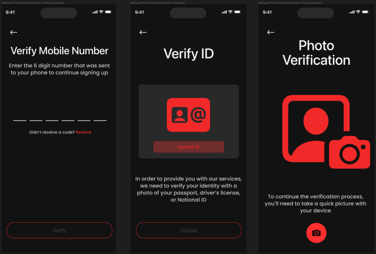
In these three steps above, we start by asking for hard proof the user is who they say they are. Besides confirming the user’s phone number, we ask the user to provide proof of their government identification that we’ll verify plus a live photo from their phone to verify the person that’s signing up for the account is them.

Here we have two options for different loading screens and their accompanying text. I varied the tone between the titles; however, I think I would advocate for the text in Option B. Even though “Hang Tight” is an idiom, I think it works well as a relaxing phrase in a tense situation (as you may be worried that things have to be verified, did you do things right, will you have to enter them again, etc.). Cops will also drop this to people they pull over when they go back to their car or have to verify information as a way to not tell the people exactly what’s happening while still being casual and conversational.

Success and failure screens. At this point, we can head into our app, or restart the process/get help/restart the process if we entered something wrong.
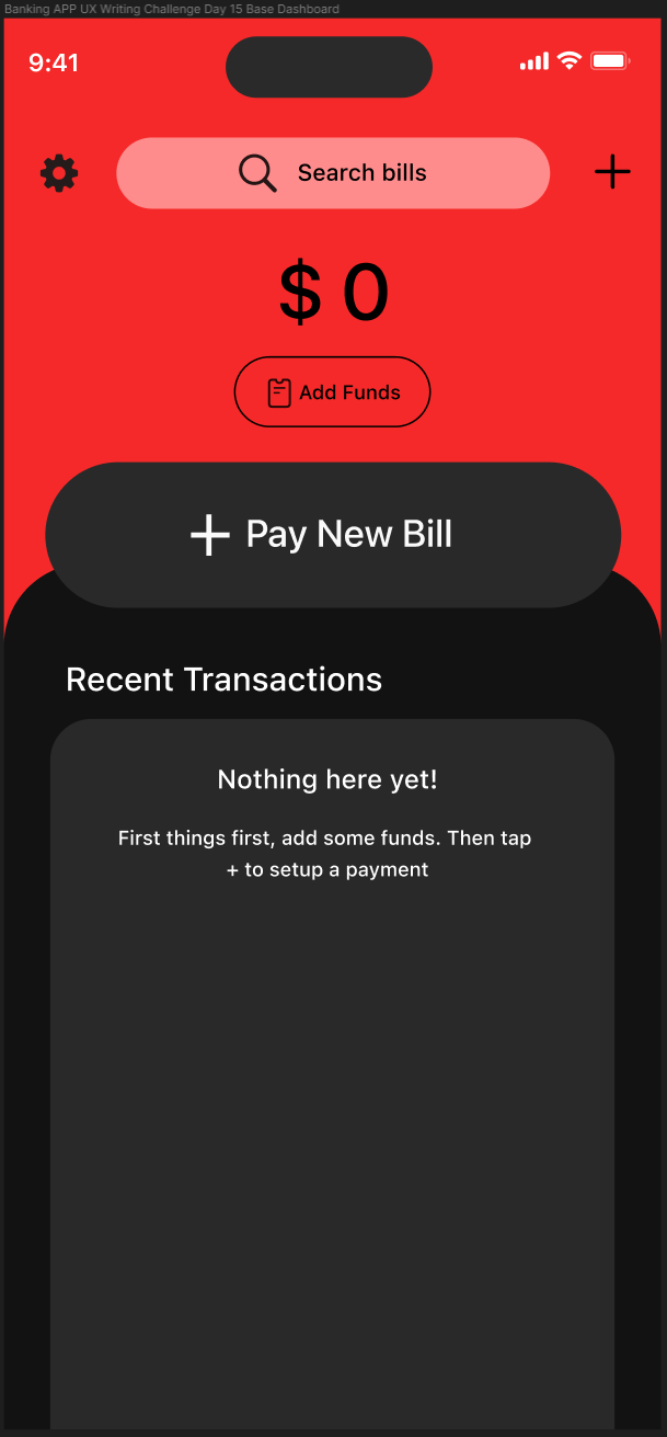
Our dashboard! This will act as the home screen for most of the app’s functionalities. Since it’s a banking app primarily focused around paying bills, we have the “Pay New Bill” front and center. The “Add Funds” sits right above it in a smaller, yet still noticeable button.
I also added the + button in the top right, which will roll up the functions on the page (pay new bill/add funds), as well as others such as making a payment.
Underneath our “Recent Transactions” section, we add some empty state text that instructs the user on what to do to pay their first bill.
If I were to flesh this app out a little more, I think I would model it a little more after other banking apps and have some extra features if you scroll down below Transactions (which I would trim tighter around the empty state text). But because I just want to address the prompt and not fully develop a banking app, I’m just showing what an app like this would need to get a user to the “aha moment.”

On this screen, you would be able to add funds from an external source to your own account to pay bills with. Adding a method to route direct deposits to your bank from the dashboard would be the only other way to add funds directly to the account.
Underneath the amount we’re deciding to deposit, we have a set of frequency buttons depending on if we want to deposit a certain amount each day/week/month/or some other custom amount, or if we’re just making a one-time transfer. So for instance, our user could select $X monthly and pay all their bills on our app instead of their bank account. For now though, since this user is trying out our app, they’re only making a one-time transfer.
On our button, we say “Review details,” to show that this isn’t the final step in the process and that the customer will be able to change their minds after this step. We also have a back button in the upper right so they can back out of the process at any time.
The methods listed are just some base options for what we could use to deposit money into our new bank account, but obviously we could add others based on what the bank accepts.
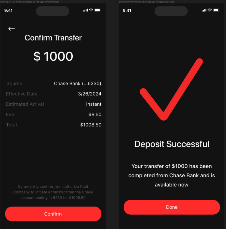
Before they commit their deposit, we show a quick confirmation screen to make sure that the user really wants to transfer the money. We also show details and have a written statement showing what exactly the user is committing to doing.
The button text also reads “Confirm” to make sure the user knows they are agreeing to the information above.
We then tell the user they’ve been successful and that the amount they deposited and where they got the money from is accessible in their account (or when it will be). The “Done” button shows they are done with this action and will send them back to the dashboard.
Woo! Money! Now let’s spend it.
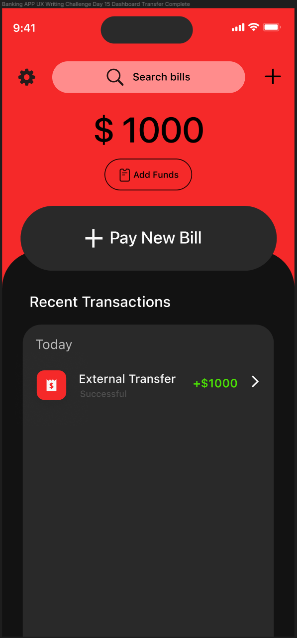
The transaction is added under the Recent Transactions category with some colorful text and symbols. Later, we’ll show another option for this format, but for now we’re going to stick with this.
The empty state text is now gone, but our “Pay New Bill” button still remains. This will eventually be replaced by tracked information about the account such as money in, out, and the amount being charged to the account monthly.

We’re now going to pay our first bill. The first thing we’re going to prompt the user to do is to select a category. By selecting a category, the type of information the user can input will change based on what type of transaction the user selects.
Besides the base version of this page, I have two different examples of what kind of options we could put here. In the middle, I’ve included a personal transaction from our user to their daughter, Maria, to help fund her college tuition.
On the second option, I have an option for us to capture the details from a physical bill and route a payment to the requesting entity. This could be a power/water/electricity bill, or anything else that comes in paper form the user wants to pay.
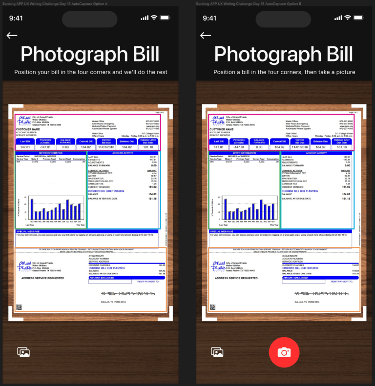
Here I show an example of what our AutoCapture system would look like, complete with a water bill (super real) set out on a table (also super real). We also have the option to upload an image from our phone if the user doesn’t want to add a live image. The option to do this could also be added on the previous screen when the user taps the “AutoCapture bill” button.
Option A will automatically capture the bill when it detects it within its four corners, while Option B requires the user to press the camera button once they think the bill is positioned correctly.
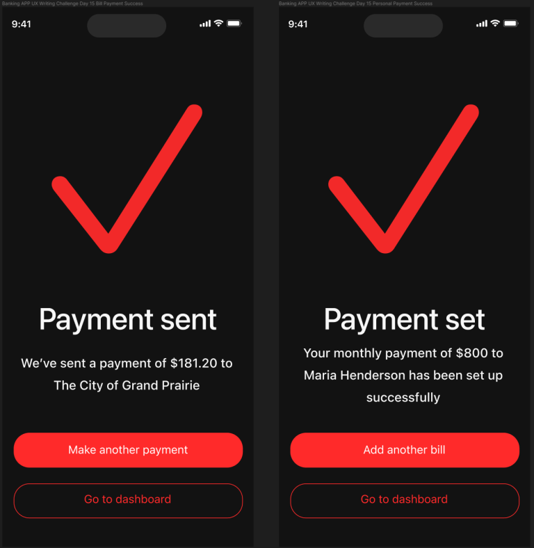
We then have two different success screens for the two different types of payments. The screen on the left shows that the payment has been sent to the entity requesting the bill, in this case The City of Grand Prairie. The screen on the right shows the successful recurring payment to the daughter.
Each option then has the option to set up more payments if the user wants to just take care of a bunch of bills at the same time, or the option to go back to the dashboard if they want to see their payments. Since this is our user’s first time using the app and they want to see if the payments succeeded, we’re going to head back to our dashboard.

Here we finally arrive at the “aha moment” for our user. They’ve now successfully set up multiple transactions, including depositing money to their new account, using that money to set up a recurring payment for their daughter’s college tuition, and making a payment to their water company.
We also have a couple of cool tracking options where the “Add new bill” button was before to show the user how much they’re spending on transactions they’ve set to certain frequencies. So if you were sending $25 a week to your roommate to buy drinks, that would track as $100 billed every month. This would also track automatic transactions such as subscriptions and other transactions the user could manually flag.
On the left, we have a version of recent transactions that have colorful labels and amounts that are color-coded based on whether they add or subtract from the account. I prefer this version, but I also included a version that sticks within the color scheme of the rest of the app.

For the final screen, I have the user tap on their daughter’s college tuition transaction to check the details so they can send a screenshot to their daughter to show the transaction. Or just “proof” for their own records or even just peace of mind, a receipt they can point to if anything goes wrong. Further satisfying the “aha.”
We have two options for the title, with one showing the personal note that the user labeled the transaction with, and another with a title of just “Transaction Details.”
The user sends the screenshot to their daughter, and, now that they’re familiar with the app and the convenience they will have sending and monitoring money out of their account, they decide next month they will add a monthly withdrawal from their main account so they can manage their finances better.
Thanks Cool Company, you’re the best!
And that concludes the UX Writing Challenge. If you have any thoughts or questions about the project, feel free to reach out to me on LinkedIn. Otherwise, thank you for following along.